In search of Utopia
Article by James Pardey for the Retrospective catalogue.
Students forty years ago did not have Wikipedia to mug up on Camus, McLuhan, Wittgenstein or
Chomsky. Books were the thing back then, and for countless students the books of choice were the
Fontana Modern Masters, a groundbreaking series of pocket guides on the thinkers and theorists whose
ideas had shaped the twentieth century. Today, however, the books are remembered not for their
contents but their eye-catching covers, which featured brightly coloured abstract art by a young English
artist named Oliver Bevan. The series was launched in 1970 although its cover story starts in the early
sixties, when Bevan was himself a student at the Royal College of Art. Like many young artists he
struggled to find a direction in which to develop his art and recalls that at times he ‘went through the
motions of painting without much conviction’. It was, he says, ‘a period of coffee breaks and confusion’
that lasted until he attended a lecture on Victor Vasarely.
Vasarely wanted to democratize art and make it accessible to everyone irrespective of background or
education. For him this meant art based purely on vision and his abstract geometrical paintings made
extensive use of optical effects, where the brain alternates between different interpretations of an image.
This Op Art, as it became known, struck a chord with Bevan, as he later explained: ‘I had felt
uncomfortable that many people didn’t understand contemporary art and thought it needed to be more
accessible. In Vasarely’s own terms, geometry is accessible, and the day after the lecture I threw myself
into it. I did hundreds of drawings and small gouache studies, and occasionally produced a certain kind
of visual ambiguity which I then turned into a painting’ (Figure 1).
Eight of these paintings were selected for his first solo exhibition at the Grabowski Gallery, London, in
1965. The paintings were based on isometric projections of a cube (Figure 2) and played on the viewer’s
visual perception through tonal flicker, ambiguous perspective and figure-ground reversals. Bevan
termed this ‘a conflict between the certainty of the geometry and the uncertainty of the perceptual
mechanism in dealing with it’ and saw such conflicts as a form of viewer participation in which the
viewer’s subjective response to a painting contributed to the creative process. The exhibition attracted
favourable reviews, with the art critic Norbert Lynton writing that Bevan’s art ‘achieves its aim of
intensifying our awareness of our perceptual processes, which implies our awareness of the visible
world’.
A second exhibition at the Grabowski Gallery in 1967 extended Bevan’s work with isometric cubes to
include shaped paintings and a larger colour palette, which he said was ‘intended to provoke the viewer
into an active relationship with the work’. His interest in colour was influenced by Josef Albers, whose
Homages to the Square and Interaction of Color showed how colours seen separately appear to change
when juxtaposed. Albers had called this ‘the discrepancy between physical fact and psychic effect' and
as Bevan’s fascination with colour grew so his paintings became less optical. The use of numerical
sequences in his next two series of square and triangle paintings led to the idea of incorporating time
into his work, and one way to do this was by extending the concept of viewer participation from seeing
to doing. This was made tangible in a third exhibition at the Grabowski Gallery in 1969 which included a
tabletop piece of sixteen square tiles which were each divided diagonally into two of four colours. The
tiles could be rearranged to create different combinations of figure and ground, as visitors to the gallery
were soon discovering. The viewer thus became an active participant in creating the artwork on display
which, being rearrangeable, changed over time.
Bevan then developed the idea further, using magnetic tiles on a square steel sheet covered with black
canvas. Connections used six such tiles of three different sizes and shapes which were painted with
yellow triangles, emerald green stripes, and orange and dark blue parallelograms (Figure 3). Like his
earlier tabletop piece, the tiles could be arranged to create larger tesselating patterns and shapes, only
now it could be hung on a wall like a painting. Connections was shown at the Institute of Contemporary
Arts in 1969-70 as part of Play Orbit, an exhibition of artworks that visitors could interact or 'play' with in
the manner of toys and games.
Vasarely, meanwhile, had started selling boxed kits of rearrangeable tiles for people to create their own
Op Art. The tiles were pieces of his plastic alphabet and consisted of coloured squares on which a smaller
geometric shape was superimposed in a different colour. The pieces were magnetic and came with a
frame in which to arrange them, which could then be hung on a wall. However, the similarity with
Bevan’s work did not end there. Vasarely’s kits moved away from traditional art markets, where one-of-
a-kind originals were the luxury of a privileged few, towards mass-produced affordable art available to
all. Bevan shared this desire to democratize art and his next project achieved it in an entirely original
and unexpected way. For it was around this time that John Constable, Art Director at Fontana Books,
was looking for a cover concept for the Fontana Modern Masters. According to Bevan, Constable had
been experimenting with cut-ups of The Mud Bath, a key work of British geometric abstraction by the
painter David Bomberg, but after seeing Bevan's rearrangeable tiles Constable commissioned Bevan to
create the cover art. The covers of the first ten books were based on isometric cubes and coloured in
vibrant patterns of orange, yellow and emerald green (Figure 4). Vertical stripes were added in a fourth
colour that varied from cover to cover and amplified the optical flickering effect. The books were
published in 1970-71 with a statement on the back revealing they were tiles for a larger painting:
‘The cover of this book is one of a set of ten, comprising the covers of the first ten titles of the Modern Masters
series. The set combines to form the whole painting, and can be arranged in an unlimited number of different
patterns.‘
This incentive for people to collect all ten books and make their own Op Art was taken up by booksellers
who mounted spectacular cascading window displays. The books sold extremely well and Bevan recalls
seeing people with them on the London Underground. ‘My democratic urge was well satisfied,’ he said,
‘because everyone could have an inexpensive piece of my work.’ A second set of covers for the Fontana
Modern Masters in 1971-73 were also rearrangeable pieces of a painting and while the covers were much
less optical, Bevan felt the colours were more interesting. ‘The effect is quieter but richer,’ he said.
During this time Bevan also collaborated with the composer Brian Dennis on a production at the Cockpit
Theatre in Marylebone, London, of Dennis’s Z’Noc, an experimental piece in which the musicians take
their cues from coloured lights projected onto three large mobiles. This led Bevan to experiment with
light as a medium for other types of kinetic art and in 1973 he produced the first of his lightboxes. These
exploited the effect of polarized light on optically-active materials such as Cellophane and Sellotape to
create a mesmerizing display of changing colours and shifting shapes.
Each lightbox was backlit by fluorescent tubes and contained two polarizing filters, one on a light-
diffusing panel at the back and one at the front on a rotating disc. Another panel was covered with
layers of Cellophane or Sellotape from which geometric patterns had been cut with a scalpel. The panel
was positioned in the middle of the lightbox so that the patterns changed colour in a rhythmical cycle as
the polarizing filter at the front rotated. Later lightboxes used Cellophane or Sellotape on counter-
rotating discs, or discs that oscillated back and forth on magnets, which caused both the patterns and
colours to change.
For Bevan the lightboxes were a breakthrough. The problem of incorporating time in his paintings –
which he had first explored with rearrangeable tiles – was, he felt, finally solved. He had created a
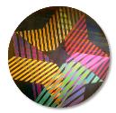
‘canvas’ for ‘kinetic paintings’ that selected colours ‘in time as well as space’ (Figure 5). This was
demonstrated on a third set of covers for the Fontana Modern Masters in 1973-74, with the text on the
back now reading as follows:
The cover of this book is one of ten views of a kinetic painting, Pyramid, by Oliver Bevan. The painting is made of
transparent materials which only assume colours when illuminated by polarized light. When the plane of
polarization is rotated slowly (which happens mechanically in a box designed to display the painting) the colours
pass through a recurring cycle of change. Ten points of that cycle have been recorded to provide covers for the third
set of ten volumes.
The lightboxes were exhibited in London, Europe and North America, with pieces such as Turning World
and Crescendo winning plaudits from the art historian Ernst Gombrich. Bevan also found a backer for the
lightboxes and oversaw the production of editioned multiples which he signed and numbered. These
sold well, and as Bevan recalls, ‘they became a sort of cottage industry. But there were a lot of technical
difficulties. I was solving problems and wasn’t actually being very creative any more’. Eventually he
began to feel that his kinetic work had run its course and in 1977 he accepted an offer of a two-year
teaching post at the University of Saskatchewan in the Canadian prairies. This proved to be a turning
point and by the time he returned to London he had abandoned kinetic art in favour of urban realism.
Copyright James Pardey, London 2012
Figure 1. Both Ways 1, 1965. Acrylic on canvas, 150 x 230 cm.
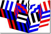
Figure 2. An Isometric projection of a cube has three visible faces of equal area and an hexagonal perimeter with all
six sides of equal length.
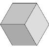
Figure 3. Connections, 1969. Painted plywood blocks with countersunk magnets, shown here in four
configurations.
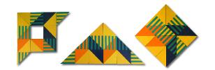
Figure 4. The covers of the first ten Fontana Modern Masters in 1970-71.
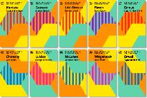
Figure 5. A point in time of a kinetic painting.